Supply-Side Expansion Has Driven the Decline in Inflation
September 8, 2023
By Mike Konczal
Introduction
After two years of persistently rising prices, inflation has finally decelerated in the first half of 2023. The most recent three-month annualized change in the core Personal Consumption Expenditure Price Index (PCE), which excludes volatile energy and food prices, was 2.9 percent—compared with 4.4 percent a year ago or 4.6 percent in January of this year. The deceleration is even more dramatic when it comes to prices faced by consumers: The most recent equivalent number for the Consumer Price Index (CPI) was 3 percent in July, versus 6.4 percent a year ago. This drastic change isn’t just the result of specific industries or specific measurements. And while there is still a way to go to bring inflation back to a sustained lower range, and there could be some reversal in declining inflation, the situation is dramatically better now than it was even six months ago.
The labor market has remained strong as this decline in inflation occurred. The unemployment rate averaged 3.6 percent in 2023, with monthly shifts largely reflecting the positive development of more workers entering the labor force. The employment-to-population ratio of 25-to-54-year-olds has reached levels not seen in two decades. Real GDP growth in the first half of 2023 has stayed at a strong 2.2 percent. Many economists believed that this was not possible—that we couldn’t see substantial deceleration in inflation without an increase in unemployment or even a recession. So, what accounts for the deceleration in inflation? Though most can just be happy inflation is declining, how that is happening has consequences for understanding this economic moment.
The analysis in this brief builds on the work of Shapiro (2022) to find that:
- Inflation has fallen at such a speed that it is no longer in the range predicted by a persistent Phillips Curve model trained on data from the 1970s. Scenarios of entrenched, higher inflation are behind us.
- The majority of disinflation has been driven by expanding supply rather than decreasing demand. Decomposing price and quantity changes for 123 core PCE items, I find 73 percent of all core items, and 66 percent of services, see prices falling with quantities increasing—a sign of expanding supply.
- Using an arbitrary cutoff point, around a third of items could be described as moving straight down. For overall core categories, a weighted 30 percent move straight down; the remaining is split with 36 percent from supply expanding and 34 percent from demand decreasing.
- Supply expansion driving disinflation is even more true when it comes to categories that historically have a strong relationship with demand in the economy. The disinflation we’re seeing is therefore broad and could continue.
The Two Stories the Phillips Curves Told
Before we look at the drivers of disinflation, it’s worth documenting inflation’s decline—not just in an absolute sense, but also relative to a scenario of inflation persistence mirroring the 1970s, which people were worried about in 2022. As we will see, inflation is falling relative to what the Federal Reserve is likely estimating in its internal models. The Federal Reserve estimates and forecasts underlying inflation using the Phillips Curve, a relationship that is meant to describe the aggregate supply in the economy in the near future. The Fed generally thinks that inflation is generated by what people expect inflation to be, in addition to how hot the economy is running, as demonstrated, for instance, by low unemployment rates.
We can estimate a Phillips Curve model similar to one used by the Fed (described at length in Yellen 2017 and reiterated in Powell 2018; see also Hooper, Mishkin, and Sufi 2019). This version equates inflation to previous inflation (using its past two quarters) and expected inflation (projections for the next 10 years), as well as actual unemployment versus what the Congressional Budget Office (CBO) estimates as a natural rate of unemployment. Inflation expectations are taken from the Federal Reserve’s FRB/US model’s historical data, which is a standardized version of the Federal Reserve Bank of Philadelphia’s Survey of Professional Forecasters from 1991 forward and a mix of sources prior. A term capturing inflation in imported goods is usually included, though omitted here.1 The equation looks like this:
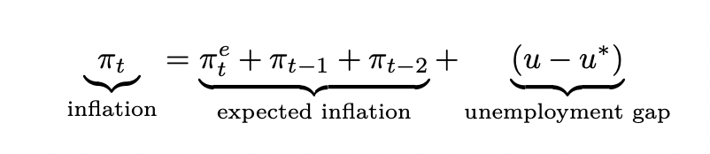
This gives the Federal Reserve one answer to the question of what the level of inflation really is. But over what range of data should we estimate this model? Recent research (Cecchetti et al. 2023) suggests that it matters when the data starts. Specifically, whether data from the 1970s is included or not changes the results and the story the model tells. For my analysis, I ran this twice: first, from 1991 to 2019, and then from 1970 to 2019. I ran this quarterly, with the months for each quarter starting with July, to use the most current data. I then took the two models and predicted them forward to last month, using the actual data, yielding the following results:
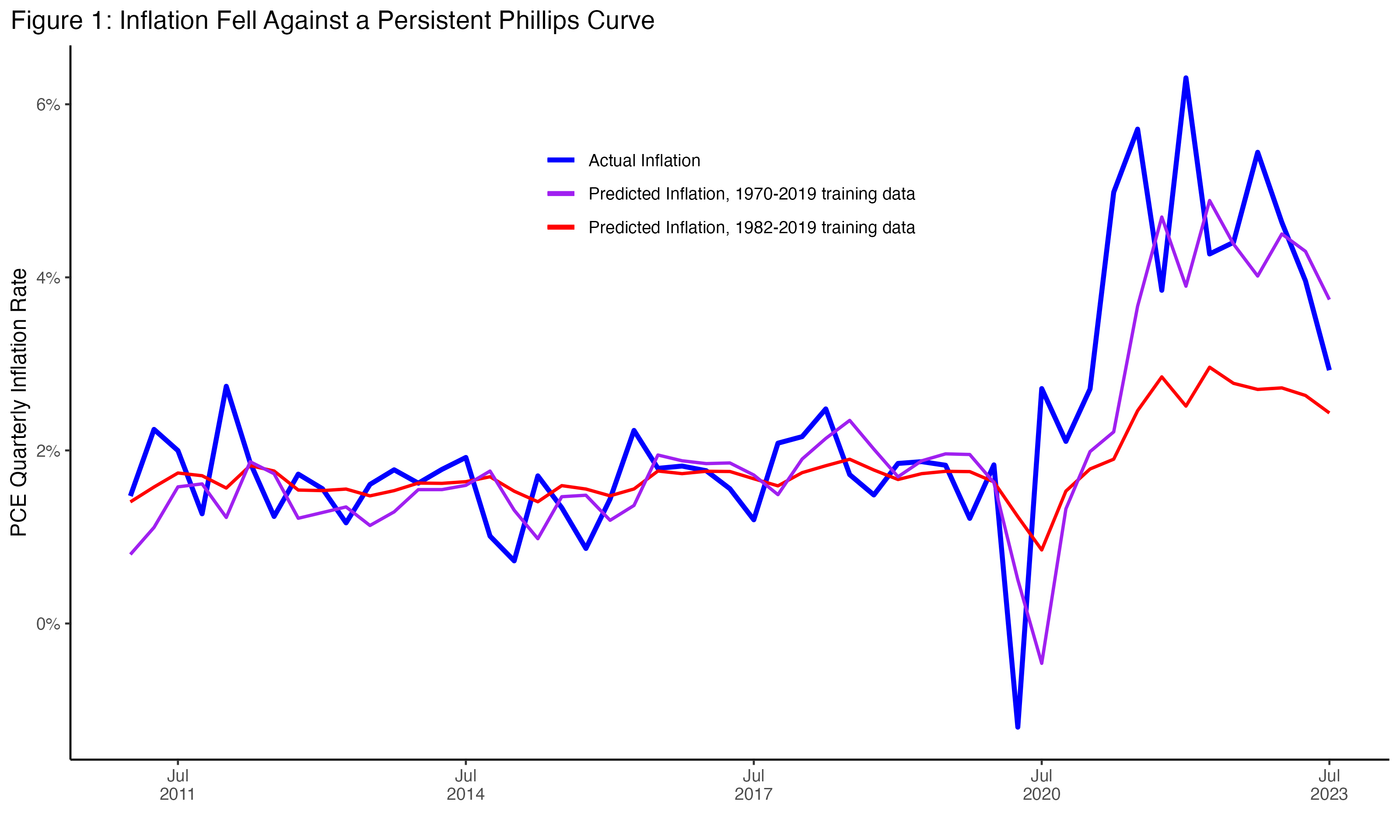
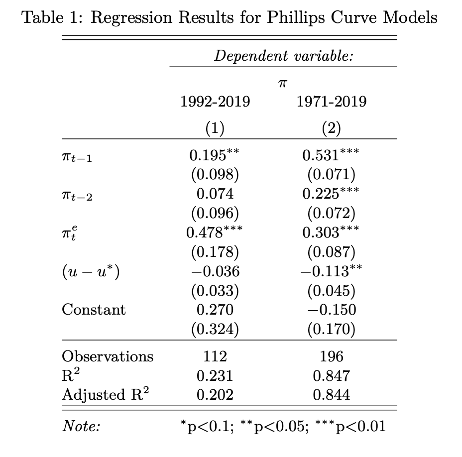
This single model told two very different stories about what happened in the recovery, depending on what data it was given. In the first model that starts in 1991, future inflation is more important, reflecting the consistent and declining inflation of the 1990s and early 2000s, known as the Great Moderation. Unemployment is not a significant variable during this time period. Figure 1 shows this model predicting that inflation over the past several years would slightly increase, but nowhere near as much as actual inflation did, reflecting low forward expectations of inflation.
In the second model, inflation is persistent and driven by recent inflation as being far more important, with changes in unemployment a statistically significant variable, reflecting the experience of the 1970s. In this version, we see predicted inflation mirror where inflation actually was, and stay there through 2022. (The coefficient on unemployment in Table 1 implies a “sacrifice ratio” of 9, or, that if this model held, unemployment would have had to go up 13.5 percent for core PCE inflation to drop the 1.5 percentage points it did.)
These are two very different stories about how inflation works and what was happening in 2022, and they are both generated by the same model. They demonstrate why there has been such disagreement within the Fed and elsewhere—even within this particular framework and model—over which set of these assumptions actually drove inflation.
But as we can see, inflation has officially broken out of the 1970s model range. That it was in that model’s range for much of 2022 helps explain the serious concerns many had about the persistence of inflation and the worries that it would sustain itself. However, at least for the moment, that story is over. How low it can go and whether there will be any reversion is an open question, but the specter of the 1970s is far behind us.
Supply versus Demand
So, how did this happen? There are generally two explanations mainstream economics uses to describe how inflation could fall while the economy remains strong. The first is that we are expanding the supply of the economy. This explanation would say that we are seeing the end of a supply shock and settling of a period of relative price disturbances that characterized the reopening after the deployment of vaccines. Policymakers are also responding to the international economic consequences of Russia’s invasion of Ukraine. Thinking back to an Econ 101 lesson, if increasing supply were the driver of inflation falling, such as in Figure 2, it would result in expanded quantities of items consumed at lower prices.
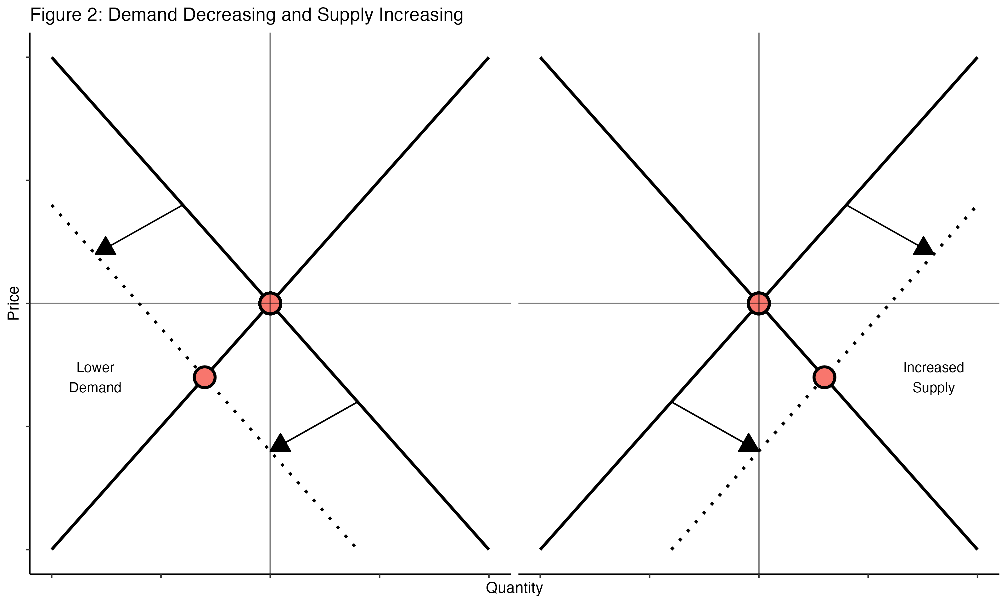
The second explanation is that we are decreasing demand, but in such a way that just a small decrease in spending has an outsized impact on inflation. (The term used to describe this is “nonlinear” impact—as in, we are on a nonlinear part of the Phillips Curve.) If the economy were too hot in a way that was characterized by nonlinear dynamics, just a little bit of lower demand would cause prices to fall in much higher proportion than any unemployment or slowdown. These kinds of stories would be consistent with lower quantities of items consumed alongside lower prices, or a shift left of an aggregate demand curve.
There is evidence for each. On the supply side, we’ve seen the fall in the Federal Reserve Bank of New York’s Global Supply Chain Pressure Index (GSCPI), which skyrocketed early in the pandemic. The relative proportion of goods and services being purchased is no longer changing, and is slightly reverting back to pre-COVID levels. The price level for energy has declined relative to where it was before Russia’s invasion, and commodity markets are stabilizing.
On the demand side, we see nominal wages falling from somewhere between 5 and 6 percent to somewhere between 4 and 5 percent, depending on the measurement. (This is happening even as real wages are increasing, because inflation is falling faster.) These kinds of declines in nominal wages are generally seen only in recessions. Measures of labor market search, like the quits rate and job openings, have fallen substantially. Residential investment, which supports numerous additional industries, has fallen about 14 percent over the past year, while housing inflation slowed.
National Accounts
It’s difficult to measure the relative importance of these explanations outside of models that require strong assumptions. However, the National Economic Accounts compiled by the Bureau of Economic Analysis (BEA) give us the ability to look deeper into inflation—beyond just the price level to the level of real spending, or quantities. The BEA tracks three things when it comes to the categories of items that people purchase in the economy: the overall amount of dollars spent on each category, the actual amount people get, and the level of inflation for that item. Or, the quantity of items, the price people pay for an item, and the price and quantity combined. Anyone who discusses “real spending” is referring to this idea of separating out the quantity and inflation level from the overall amount that is actually spent in the real world. The underlying National Economic Accounts tables have both nominal spending (the entire amount in current dollars) but also real spending (the actual quantities) and the amount paid for a quantity (the inflation level). They do this across all the categories they track, and this work can give us a granular view of what’s happening with inflation across many different kinds of spending.
Building on the work of Adam Shapiro of the Federal Reserve Bank of San Francisco (Shapiro 2022), I looked at 133 PCE categories at the fourth level of aggregation. I then excluded energy and food categories, to focus on core changes among the remaining 123 categories, though the results are the same using the entire basket.
In order to help reduce the monthly variance of these numbers, I looked at the six-month changes in prices and quantities for these 123 categories. I then compared the result ending July 2023 with the result ending December 2022, revealing the slowdown in 2023.
Note that this is a deceleration of the rate of increase. So if an item had 5 percent price growth and 1 percent quantity growth at the end of 2022, and then it had a 3 percent price growth and 2 percent quantity growth ending July 2023, it would show up as (-2,+1), or on the bottom right quadrant. It would be categorized as supply-increasing in this exercise, as the rate of price increases fell while the rate of quantity increases picked up.
Here is what this looks like for the 123 categories, with the item size weighted by percent of nominal spending:
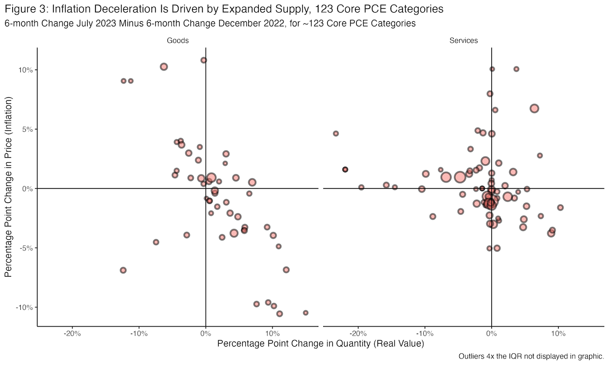
(Here is a spreadsheet with each category. The full code for this exercise is located here.)
Table 2 provides summary statistics of this movement:
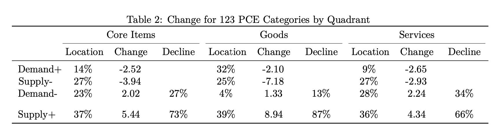
In Table 2, location shows the amount of categories in each quadrant weighted by their size, measured as their share of nominal consumption. Change is the weight multiplied by the change in price for each category, added up for each column. And decline shows the relative importance of the change for the two categories that slowed inflation, slowing demand and supply increase. Of the core PCE categories that saw price declines, weighting by their share of nominal consumption, we see that 73 percent came from supply expansion, while 27 percent came from decreasing demand.
Supply increasing as the driver of disinflation is very notable for core goods, where 87 percent is driven by an expansion of supply. This is something we’d expect, given opening supply chains and semiconductors and important raw materials becoming more accessible. But the Federal Reserve and other experts know this. And just as they looked through some of these big price increases in goods markets in 2021, they are also looking through the big price decreases in 2023 and focusing on services, which they worry has inflation that is more persistent. But, remarkably, we also see large supply shifts within services as well, where 66 percent of the decrease in services inflation has ended up with increasing quantities.
The endpoints here—six-month change against a baseline ending seven months ago in December 2022—were chosen in advance of the analysis and fit the period we want to analyze. But just to make sure it’s representative of the entire sample, we run this analysis with multiple values. We check each value between the three- to eight-month change, and for each of those we set the ending point being between zero to six months prior to that monthly change period. This is a total of 42 trials. For the percent of services disinflation that is driven by supply increase, the median is 62 percent, and the mean is 61 percent. So these results hold broadly across model specifications.
There is a large category of services that have near-zero quantity changes. There are many theories for why inflation could fall without any change in quantity. It could reflect shifts in both decreasing demand and increasing supply that offset each other in quantities. But it could also mean we are on a vertical part of the supply curve, in which spending is reflected entirely in prices. Perhaps, as in New Keynesian models, it means that firms no longer anticipate higher future costs and are slowing their price increases to compensate. It could, perhaps more controversially, be the result of the Federal Reserve’s actions coordinating a decline in prices through the management of economy-wide expectations.
We can’t distinguish between all of these possibilities here, but it’s useful to get a sense of the proportion of changes here that could be described as inflation moving straight down. I check which categories have less than an absolute 0.1 percent change in quantities, an arbitrary cutoff point, and a surprising number fit into this category. For overall core categories, a weighted 30 percent fit into this category of moving straight down; the remaining is split with 36 percent from supply expanding and 34 percent from demand decreasing. I find that less than 1 percent of goods fit in this center category. Among the declining services categories, 36 percent are in the center, with 38 and 26 in demand decreasing and supply increasing, respectively. This means that 62 percent of the decline in services is not from decreasing demand.
Inflation Categories and the Business Cycle
In the years immediately preceding the COVID-19 pandemic, there was a body of work that emphasized that price changes for many categories were not particularly sensitive to demand conditions in the economy, and instead reflected other factors, like global developments.
There were many terms for this result, be it “slack and cyclically sensitive” inflation (Stock and Watson 2019) or “procyclical versus acyclical” inflation (Mahedy and Shapiro 2017). Leading US macroeconomic research used these distinctions, comparing tradable versus non-tradable items when constructing state-level Phillips Curves (Hazell et al. 2020). Much of the debate over the persistence of inflation in 2021–2022 looked at inflation metrics that isolated out the tails of the distribution of price change categories, for instance by looking at the median change in CPI price categories (Ball et al. 2022).
Inflation declining is a thing to celebrate. But if the disinflation is all coming from “acyclical” industries that are indifferent to demand conditions, while the more cyclical parts of the economy continue to have high inflation, that could be a problem. It could mean all the low-hanging fruit of disinflation is over, and inflation will stay near the current level going forward.
Now if that level turned out to be only a little elevated, that would be fine, and perhaps even healthy. There are strong arguments for a higher inflation target or target range (Bloesch 2022) to help us move past the challenges of macroeconomic stabilization in the 21st century. But there is a lot of uncertainty with this current level of inflation, and for the immediate moment, more disinflation that comes without higher unemployment would be a good thing.
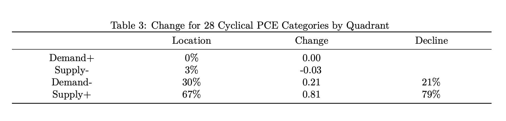
The procyclical versus acyclical inflation methodology pioneered in Mahedy and Shapiro 2017 allows us to examine this. In that work, they identified categories that would count as “cyclical” inflation, which is to say that their inflation rates had a negative and statistically significant relationship with an unemployment gap. These 28 categories represent around 33 percent of the consumption basket in 2023. We can rerun the analysis just looking at these categories and provide the same charts, color-coding services versus goods.
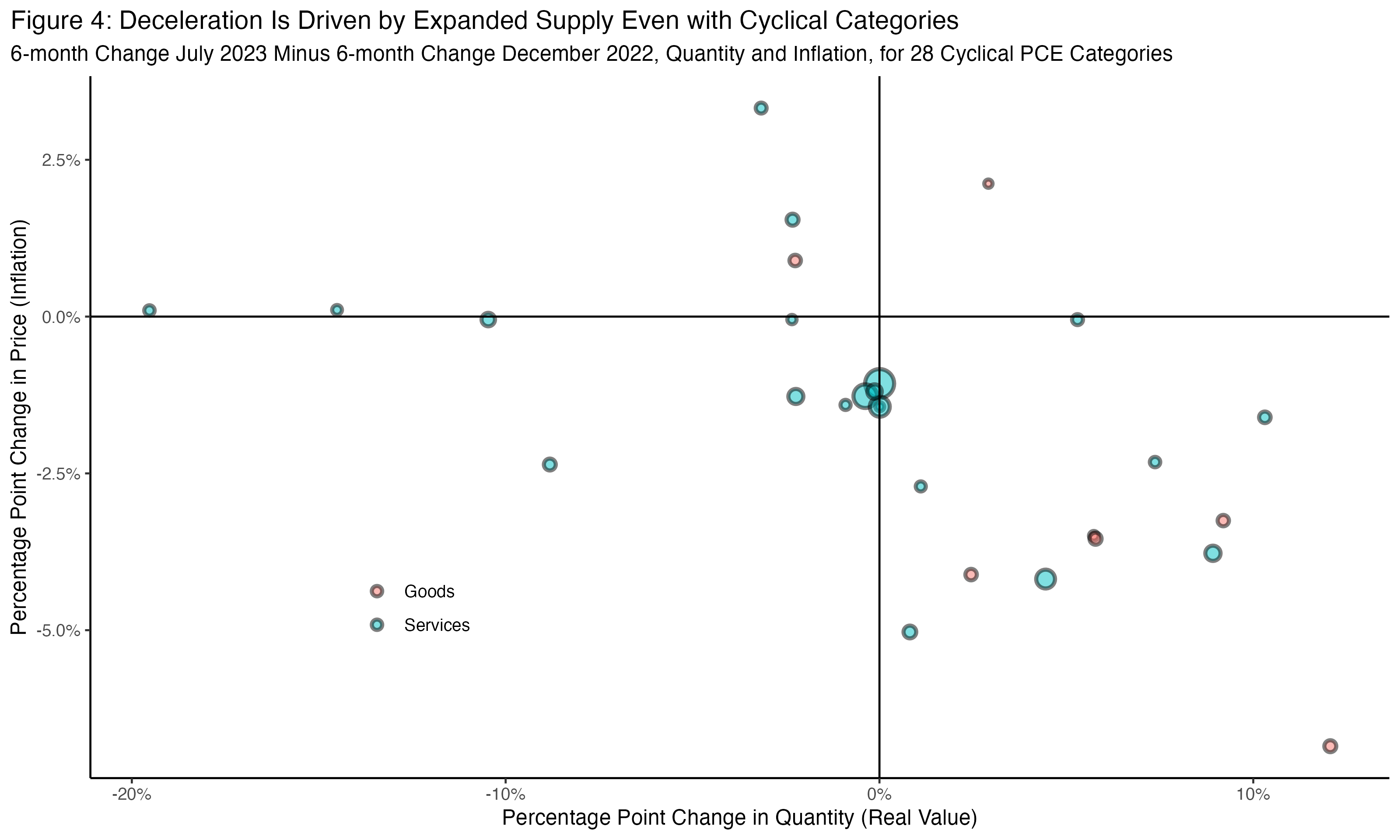
The extent of supply expansion here is even more remarkable: 79 percent of disinflation is driven by supply expansion, higher than the overall basket. This is evidence that disinflation is broad and is happening among categories that are historically sensitive to demand conditions.
These conclusions are all preliminary, and inflation could still go in many directions. But if these kinds of results hold or continue, it would clarify an important piece of this recovery. In 2021, people often turned to these cyclical categories as a litmus test for whether or not inflation had a strong demand component to it, or, in some arguments, whether it was “transitory.” In one representative example in December 2021, Alan Blinder argued in a Wall Street Journal piece titled “When It Comes to Inflation, I’m Still on Team Transitory” that:
What could make Team Transitory wrong? High inflation is currently concentrated in things like used cars, airfares and gasoline. For example, the Dallas Fed’s version of PCE inflation, which trims out the fastest- and slowest-inflating components of the PCE deflator, is only 2.8% over the past year. But inflation could spread out more broadly across the spectrum of goods and services. (Blinder 2021)
This assumes that a supply shock would be limited to a handful of categories. And for a while, it did look this way. The Dallas Fed’s trimmed-mean PCE didn’t pick up until the fall of 2021, but it did skyrocket in 2022. The year-over-year change was 2.8 percent in October 2021; by October 2022 it was 4.75 percent, the highest value since 1982, and it showed no signs of reversing. However, it has fallen just as fast with no increase in unemployment. The six-month change for July 2023 was 3.5 percent, with the one-month change at 2.4 percent.
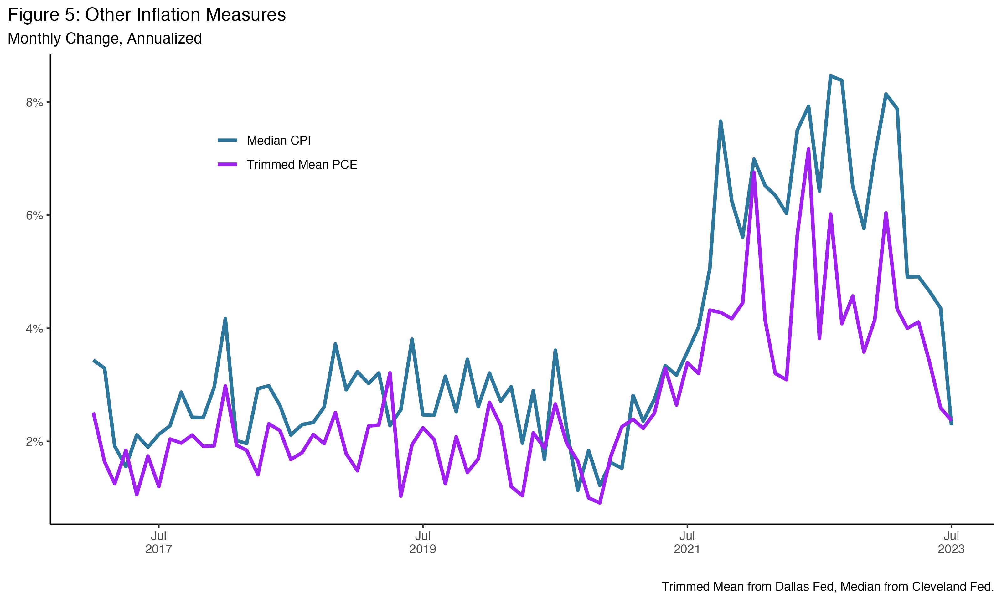
As we can see in Figure 5, this rise and fall is true for many of these alternative distributional measures of inflation. As these alternative measures started to pick up at the end of 2021 and into 2022, people assumed that since they were constructed to measure demand pressures, they were in fact measuring excess demand throughout 2022. However, supply shocks can also drive these up too, as, through many measures, they can drive a broader increase and then decrease in price indexes (Blinder and Rudd 2013). The mechanisms by which this happened is an important subject for study. But, if true, this means inflation will continue to decline.
There has been real progress in bringing down inflation. However, challenges remain. Nominal spending remains high and could put aggregate pressure on prices (Klein 2023). Meanwhile, while the labor market is normalizing, there is a risk that its rate of normalization is too fast and it could overshoot into a downturn (Mui 2023). However, at the moment, the inflation story is exactly what a “soft landing” would have predicted. A combination of resolving supply shocks and a subtle decrease in demand has driven inflation down dramatically, with no cost to the level of employment. Patience, and letting the data unfold, is the most important objective for policymakers right now.
1Including a measure for imported non-petroleum goods inflation would bring the two models shown in this exercise much more in line with each other and also in line with the data. However, this would just recreate the same debate of the two models in a different variable. Generally, measuring for imported goods inflation is meant to proxy for supply shocks; isolating it in a variable allows us to look through it to see underlying inflation (Rudd 2020). However, a central debate during this recovery has been whether or not the increase in imported goods inflation should be understood as a demand shock from US spending (Freund 2022). Having this variable explain inflation would leave us still debating what is driving inflation.
Roosevelt Author

Mike Konczal
Former Director, Macroeconomic AnalysisAs former director of Roosevelt’s macroeconomic analysis team, Mike Konczal led research focused on achieving full employment, building an economy that truly works for everybody, and developing the next generation of economic ideas.